Introduction: Delivery App Data Analysis Using Power BI
Problem Statement
In the highly competitive and fast-paced e-commerce industry, efficient delivery processes are crucial for maintaining customer satisfaction and ensuring operational effectiveness. Recently, an e-commerce company implemented an innovative app to streamline its delivery processes from warehouses to stores. This app enables drivers to scan labels instead of entering them manually and records various metrics, such as arrival and departure times.
Despite the adoption of this advanced technology, the company faces challenges in leveraging the collected data effectively. The management needs a comprehensive and intuitive way to visualize and analyze this data to identify performance bottlenecks, track key performance indicators (KPIs), and make informed decisions to enhance delivery efficiency.
The goal is to analyze the data extracted from the app and create a Power BI dashboard that provides actionable insights for management. This dashboard will be instrumental in visualizing performance metrics, understanding trends, and guiding the next stage of the company’s transformation to achieve higher operational efficiency and customer satisfaction.
Project Objectives
The primary objective of this Power BI project was to produce a comprehensive report that reviews the app’s effectiveness and identifies areas for improvement. Specifically, the management was interested in the following aspects:
- Identifying underperforming warehouse-store combinations
- Time spent at stores
- Frequency of manual entry versus scanning
- Number of damaged labels
- Timeliness of returns collection
Data Overview
The senior consultant extracted all relevant data from the app and compiled it into a CSV file. Each record in the dataset included the following key variables:
- Store ID
- Warehouse ID
- Time of arrival
- Time of departure
- Manual entry usage (1 for true, 0 for false)
- Label damage occurrence (1 for true, 0 for false)
- Returns collected
- Returns pending collection
Power BI Dashboard Design
To achieve the project goals, I designed a Power BI dashboard that provides a clear and insightful visualization of the data. The dashboard consists of several key sections:
Time Spent at Stores
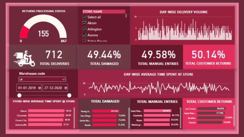
One critical metric analyzed was the average time drivers spent at stores. The findings revealed that the average time spent at stores was approximately 30.2 minutes, with most deliveries taking between 15 and 45 minutes. Notably, stores that processed deliveries quickly generally demonstrated better overall performance. This section of the dashboard features a bar chart showing the distribution of time spent at each store, enabling management to pinpoint outliers and areas needing improvement.
Manual Entry vs. Scanning
Despite the app’s capabilities, manual entry was still used nearly as frequently as scanning. Out of the total entries, 3576 were scanned, and 3511 were entered manually. This nearly equal split highlights the need for further training and possibly an evaluation of the scanning equipment or process. A pie chart on the dashboard illustrates the proportion of manual entries versus scanned entries, making it easy to see the balance between the two methods.
Label Damages
A significant finding was the high number of label damages, with a total of 3510 instances recorded. This underscores the need for improved handling and possibly revisiting packaging standards or procedures. The dashboard includes a line graph tracking label damages over time, helping to identify trends and potential causes.
Returns Management
Efficient returns management is crucial for smooth warehouse operations and customer satisfaction. The analysis indicates that we collected 3510 returns, with 1784 returns pending collection on the same day. This section of the dashboard includes a stacked bar chart illustrating the numbers of returns collected versus those pending collection, emphasizing the imperative for process improvements.
Power Bi Dashboard -Delivery App Data Analysis
Key Findings and Recommendations
- Increase Scanning Use: The nearly equal split between manual entries and scans suggests a need for further training and evaluation of the scanning process. Moving towards 100% scanning is crucial for achieving the desired efficiency.
- Reduce Label Damages: The high number of label damages indicates a need for improved handling procedures. This could involve better training for staff, revising packaging standards, or using more durable materials.
- Optimize Time Management: Analyzing the processes at top-performing stores and replicating these best practices across other locations can significantly reduce the time spent at each store.
- Improve Returns Collection: Enhancing the efficiency of the returns collection process to ensure more returns are collected on the same day will reduce pending returns and improve overall operational flow.
Conclusion
This Power BI project provided valuable insights into the effectiveness of the new app and highlighted several areas for improvement in the company’s delivery processes. This project emphasises on the Importance of Supply chain analytics. By visualizing key metrics and identifying trends, the dashboard serves as a powerful tool for management to make informed decisions and drive continuous improvement in their supply chain operations.